Florence and the Machine: "Lungs"
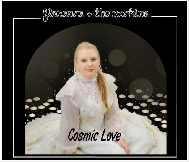
I chose this photo from the shoot as the image for the front of our Digipak. On
Florence's Digipaks, she usually chooses not to face people; most of her
poses are looking to a side with a touch of expression. On the photo I
chose, Bronte has a smile that is similar to Florence's star image. On the
front of Florence's album 'LUNGS' she is looking to the right. She
has no expression on her face but the pink flowers add a peaceful
atmosphere to the picture, which in our photo shoot Bronte's smile
could do the same job. I discussed the choice with the group, and we agreed to use it as the final photo for the front of our Digipak.
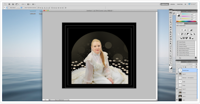
First of all, I followed the tutorial on Youtube to smooth Bronte's skin for a better star image.
Then I found a tutorial on the web that taught me how to cut the image
out. Before designing our Digipak, I knew nothing about Photoshop, and have
learned a lots Photoshop skills during this production.
I cut and pasted it on a black background. To relate the image to
the back of the digipak, I used some candles pasted those around Bronte so that it make her looks like she's sitting in the candles. This also could relate
to our music video where we used candles as props.
I thought a square image was too simple to be the front cover image; I want
it to stand out when people see it. So I changed the shape of the image
to an arch shape, I also added some different sized and different opacity circular
lights in by using the brushes. The reason I added those is I think it
could represent a peaceful moon and they also look like
stars which could related to 'cosmic'. To make an arch shape I
first cut the photo in half by using the selection tools and pasted it on a
new layer.
Scened, I used the selection tools again, cut out an elliptical portion of image and pasted on a new layer.
Then I combined those two layers.
I added the name of the band 'Florence + the Machine'. By researching Florence's albums, I found that on all of her album covers the name is on the top and the font she used was a font specific to the band. So
the font I used was the one I found online which was quite similar to Florence's.
I added the name of our album. I didn't use the name of original album, instead I
replaced the name with the name of our music video 'Cosmic Love'. The font I used was
'Brush Script M7'.
After discussing with the group, we changed the font used for the name of the
album because the font we used was too much for the song list (as we are using the same font on both the name of the album and
the song list).
 |
At the end, I added a white frame that could highlight the image. It also followed florence's style.
For the spine, I created a bar which contain the name of
our band ('Florence + the machine') the name of the album ('Cosmic
Love') and the code of our album. For star identity, I used the same font as the title for the name of our band. To make the whole
album relate, I used the same font for 'Cosmic Love' in this
bar and on front cover.
At the beginning, I was going to use a mirror effect on the subject. After I tried and it
was not as what I imagined (and the group did not like
it) so we removed this idea.
Useful Links:
Mirror Effect
Mirror Effect
http://www.photoshopessentials.com/photo-effects/mirror-image/
Cosmic Love Font
http://www.urbanfonts.com/fonts/ArtBrush.htm
By Serena Chu


No comments:
Post a Comment