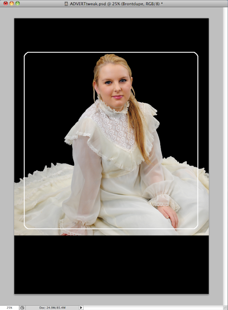
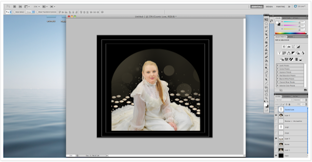
Since I had saved over the original .PSD file for the first final advert, I had to start from scratch with a black background. The peer feedback suggested we remove Thomas from the advert; I decided to use the shot of Bronte that Serena used on the digipak for two reasons. One, it helped establish a brand identity, and two, it was a photo I'd used for a recce shot previously and had already neatly cut out.
To make the white rectangle I made a square selection in the middle of the canvas and applied the smooth modifier to give it rounded corners. I filled the selection with white and then shrunk it by a few pixels. I then deleted the selection, leaving just a white border.
Staying on the border layer, I selected the outside of the layer and grew it by one pixel. I then switched to the layer with Bronte and deleted the excess of her dress.
I used the original picture of the candles and aligned them with the bottom of the border. I had to cut them out again though, as I'd cut out the original candles on the advert rather than on a separate image.
I used the same technique I used in the first advert for the candles. To do this, I selected the edges of the border (like I did in the previous step) and moved the edges of the candles onto a new layer, I then turned the opacity down to 50% to add a nice effect.
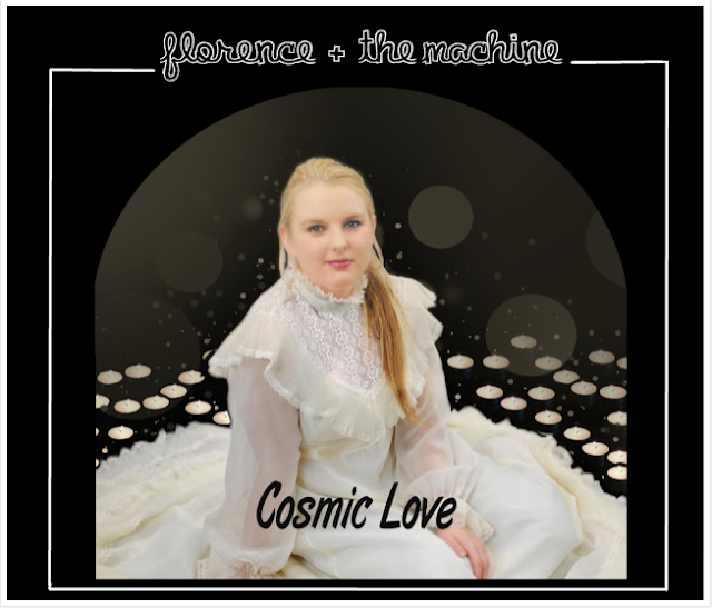
I took an orange to red gradient and applied this in a new layer over the top of Bronte, to give a feel of passion and warmth. It also helped match Bronte's to the candles as she looked too cold next to them.
Finally, I added the modified text and font. We kept the title font for the brand identity with the other objects, and edited it slightly so that the letters finished cleanly, and I chose a more suitable, readable font for the rest. I also cut down on the amount of text on the advert.


